Documentation
Installation
- Install Extension
- Ext-Conf: ADMIN TOOLS->Settings->Configure Extension->TED3
Load TED3 Content-Element-Wizard (true):
The setting determines whether TED3 overwrites the content element wizard (recommended).
The default elements are supplemented with "Text", "Image", "Fadegallery", "Gallery (Thumbnail)", - The Extension typo3db_legacy is required.
- Include Static Typoscript: Rootpage->Root-Template->Includes
1.) fluid_styled_content (required)
2.) ted3 (required)
3.) ted3 Editable Content Elements (recommended)
Delivers standard elements so that they can be edited in frontend
EXT:ted3/Resources/Private/Templates/ContentElements/
Enable TED3 in TypoScript
TypoScript:

page = PAGE
page{
 ted3 = 1
}
Make the Main-Fluid-Template editable
TypoScript:

page.10 = FLUIDTEMPLATE
page.10{
  variables {
    content < styles.content.get
    content.select.where = colPos = 0

    header_content < styles.content.get
    header_content.select.where = colPos = 1
  }
  file = fileadmin/templates/index.html
}
fileadmin/templates/index.html:
{namespace ted3=DS\Ted3\ViewHelpers}
<div id="Page">
<div>
<div id="Main" class="centered">
<div id="Header">
<div id="Logo">
<img src="/fileadmin/images/logo.jpg">
</div>
<div id="HeaderInner">
<ted3:container.col colpos="1" name="Header Content">
<f:format.raw>{header_content}</f:format.raw>
</ted3:container.col>
</div>
</div>
<div id="Content" >
<ted3:container.col colpos="0" name="Content">
<f:format.raw>{content}</f:format.raw>
</ted3:container.col>
</div>
</div>
</div>
</div>Make Default-Elements editable
TypoScript:

lib.contentElement.partialRootPaths.30 = fileadmin/templates/
lib.contentElement.templateRootPaths.10 = fileadmin/templates/
If the Fluid HTML file exists under this path, it will be used, if not, the fallback will take effect and the element will be searched for in TED3 (EXT:ted3/Resources/Private/Templates/ContentElements), if "Editable Content-Elements" was included.
If not, the default file of fluid_styled_content is rendered. (not editable)
The content object {data} is passed via the object parameter.
In DCE-Elements: {contentObject}.
A fronteditable element must always has <ted3:element.content . .> as root element.
fileadmin/templates/Text.html:

{namespace ted3=DS\Ted3\ViewHelpers}
<ted3:element.content object="{data}" class="c-element c-text" name="Text"  >
    <ted3:editing.text rte="1" field="bodytext" default="Default Text ..." />
</ted3:element.content>
Parameters of the Content-Element ViewHelper:
| settings | {save:1} | defines whether the element can be saved |
| {t3edit:1} | Button to open the TYPO3-Editview (Backendview) | |
| {hide:1} | Button to show or hide elements | |
| {delete:1} | Button to delete elements | |
| {move:1} | Enable Drag&Drop movement of elements | |
| {clone:1} | Button to clone elements | |
| {copycutpaste:1} | Button to copy and paste elements | |
| {buttonsort:1} | Buttons to move elements (if Drag&Drop is not possible) | |
| {hidemobile:0} | Button to hide elements on mobile devices Read more further down "Behavior Mobildevices" |
|
| linkfield |
string |
A button for the link assistant to link the element as a whole or to set a link without RTE. e.g.: <f:link.typolink parameter="{data.header_link}"> |
| name | string default -> cType |
Name for the element-toolbar |
| forceReload | bool default: 0 |
Makes sense for elements where JavaScript is involved. Reloading reinitializes the necessary JavaScript. |

Parameters of the Text-Editing ViewHelper
| rte | default:0 | Edit text wtih tinymce toolbar |
| field |
string (required) header, subtext, bodytext, ted3text1, ted3text2, ted3text3 |
|
| default | string | default text if textarea is empty |
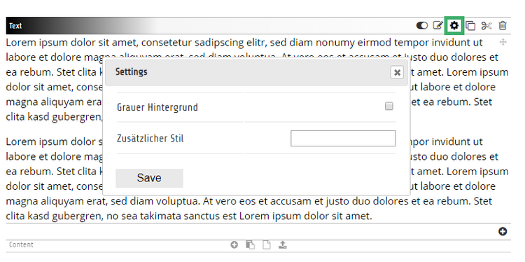
Offer some custom settings for your element
fileadmin/templates/Text.html:

{namespace ted3=DS\Ted3\ViewHelpers}
<ted3:element.content object="{data}" class="c-element c-text" name="Text"  >

    <ted3:settings.form>
        <ted3:settings.input type="checkbox" label="Grauer Hintergrund"  name="greybg" value="1" />
        <ted3:settings.input type="text" label="Zusätzlicher Stil"  name="addstyle" />
    </ted3:settings.form>

    <div class="c-text-greybg-{ted3settings.greybg} c-text-addstyle-{ted3settings.addstyle}">
       <ted3:editing.text rte="1" field="bodytext" default="Default Text ..." />
    </div>
</ted3:element.content>
Call settings outside of the Element-Context:
There's a Fluid-Viewhelper "<ted3:valFromJson([json],[key])" />
{ted3:valFromJson(json:data.ted3_settings,key:'addstyle')}Create a DCE-Element with an Image and a Text
Flexform fields cannot (yet) be made front-end editable.
Only fixed database fields such as header, bodytext, ted3text1 etc.
In the future, images can also be frontend editable...
Attention: As of TYPO3 8, at least one Flexform field must be present in DCE.
DCE-Element

{namespace ted3=DS\Ted3\ViewHelpers}

<ted3:element.content object="{contentObject}" linkfield="header_link" class="c-element c-box" name="Box with Image and Link"  >

     <ted3:settings.form>
        <ted3:settings.input type="checkbox" label="Grey BG"  name="greybg" value="1" />
     </ted3:settings.form>

	<f:link.typolink parameter="{contentObject.header_link}" class="c-box-greybg-{ted3settings.greybg}">
		<div class="c-box-inner">
			<div class="c-box-image">

                    <!-- Baseversion -->
                    <f:media class="image-embed-item" file="{field.images.0}" />

                     <!-- Premiumversion -->
                     <ted3:editing.image  field="image"   />

			</div>
			<div class="c-box-content">
				<h3 class="c-box-headline">
					<ted3:editing.text field="header" rte="0" default="Headline" />
				</h3>
			</div>
		</div>
	</f:link.typolink>
</ted3:element.content>
Parameters of the Image-Editing ViewHelper (only in premiumversion)
| all parameters of the TYPO3-ImageViewHelper | width, height, min-width, min-height, alt, etc. | |
| field |
string (required) image, assets, media |
|
| cropable | bool (default:1) | image will be cropable in frontend |
| initHeight | string (default:"") | cropable startheight |
| alt | string (default:"") | Alt-Text |
| mobileWidth | string: 600px | Only possible with a user_isMobile function (see below) |
Nesting:
Create elements with gridelements or container
1) Editable gridelement
TypoScript as usual:

tt_content.gridelements_pi1.20.10.setup {

  # ID of gridelement
  1 < lib.gridelements.defaultGridSetup
  1 {
    cObject = FLUIDTEMPLATE
    cObject.file = fileadmin/templates/2Cols.html
  }
}
See setting {save:0}, as the element itself does not need to be saved.
If you supplement the 2-Col-Element, for example with an editable heading <ted3:editing.text ... />, you would have to set {save:1}.
fileadmin/templates/2Cols.html

{namespace ted3=DS\Ted3\ViewHelpers}
<ted3:element.content object="{data}" class="c-element c-2cols" settings="{save:0}" name="2 Spalter">
    <ted3:settings.form>
         <ted3:settings.input type="checkbox" label="Asymmetrisch"  name="asym" value="1"/>
    </ted3:settings.form>
    <div class="floatchildren c-2col-asym-{ted3settings.asym}">
        <div class="c-2col-col">
            <ted3:container.col colpos="0" container='{data.uid}' name="Col 1">
                <f:format.raw>{data.tx_gridelements_view_column_0}</f:format.raw>
            </ted3:container.col>
        </div>
        <div class="c-2col-col">
            <ted3:container.col colpos="1" container='{data.uid}' name="Col 2">
                <f:format.raw>{data.tx_gridelements_view_column_1}</f:format.raw>
            </ted3:container.col>
        </div>
    </div>

</ted3:element.content>
2) Editable containerelement
{namespace ted3=DS\Ted3\ViewHelpers}

<ted3:element.content object="{data}" class="c-element c-2cols" settings="{save:0}" name="2 Spalter Container">

    <div class="b_multicolumn b_multicolumn--twocols">
        <div class="b_multicolumn__col" >
            <ted3:container.col colpos="101" container='{data.uid}' name="Col 1">
                <f:for each="{children_101}" as="element">
                    {f:cObject(typoscriptObjectPath: 'lib.containerElements.renderContent', data: element)}
                </f:for>
            </ted3:container.col>
        </div>
        <div class="b_multicolumn__col" >
            <ted3:container.col colpos="102" container='{data.uid}' name="Col 2">
                <f:for each="{children_102}" as="element">
                    {f:cObject(typoscriptObjectPath: 'lib.containerElements.renderContent', data: element)}
                </f:for>
            </ted3:container.col>
        </div>
    </div>

</ted3:element.content>
Parameters of the Container-Col ViewHelper
| colpos | required (int) | TYPO3 colPos |
| container | int (required on gridelements), no necessary on page-templates | uid of the parent element |
| name | string | Name of the content-area |
| allowOnlyEmpty Addzone |
bool (false) |
If set, only one content element can be created within the container. For example, you only want to allow one BG-element in the header area. |
| forceReload | bool (false) |
If an element within the container is edited and saved, the entire page reloads. |
| access |
string (null). "admins" -> only T3-Admins can edit content "users:1,2" -> only user with ID's 1 or 2 can edit content "groups:1,2" -> only groupmembers with id 2 can edit content |
This allows you to control who can edit elements within the content container |
| addzone (only in premiumversion) |
JSON-Array |
This allows you to control which buttons are available for creating new elements. If an element is created via a file (files, or fromfiles or via dragNdrop), There is a “fileToContentMap” in the JavaScript API, which can be extended: Ted3.fileToContentMap.png = {field:"assets", This creates an image-element when uploading or selecting a PNG file. To extend Javascript-Settings use: fileadmin/ted3/js/ted3-user-override.js |

RTE Formats
You can set your owen styles for the Tinymce toolbar. You can do this also in the following file:
fileadmin/ted3/js/ted3-user-override.js
Ted3.tinymce4.style_formats = [
    {title: 'MyFontStyle', block: 'p', classes: 'myFontstyle'},
    {title: 'Comment', inline: 'span', classes: 'comment'},
    {title: 'My Style', selector: '*', classes: 'myStyle'},
];
Further RTE-Configurations
e.g.: (Add a custom plugin and extend the toolbar)
Ted3.tinymce4.external_plugins = {
      myplugin: 'https://mydomain.com/fileadmin/js/myMceplugin.js'
};

Ted3.tinymce4.plugins = [
    'myplugin advlist autolink lists typo3link charmap visualblocks anchor nonbreaking',
    'searchreplace visualblocks code template',
    'insertdatetime table paste codesample'
];

Ted3.tinymce4.toolbar = [
    'myplugin | undo redo |  styleselect | formatselect | charmap | visualblocks | code | codesample | pastetext',
    'bold italic underline |  alignleft aligncenter alignright alignjustify | bullist numlist  | table | typo3link unlink '
];
Background Images with subcontent-area
There is an editing ViewHelper for BG images. In the future, images can be created and exchanged directly.
Also with adjustable height and BG position. (Settings)
Possible fields: media, assets.
{namespace ted3=DS\Ted3\ViewHelpers}
<ted3:element.content object="{data}" settings="{save:0}" name="BG-Image"  class="c-element c-bgimage" >
    <ted3:settings.form>
        <ted3:settings.input type="checkbox" label="Content"  name="content" value="1"  />
        <ted3:settings.input type="text" label="Höhe"  name="height" size="4" default="30vw" />
        <ted3:settings.input type="text" label="Bg-Position"  name="bgstyles" default="center center"  size="24" />
    </ted3:settings.form>
    <ted3:editing.bgimage field="media" class="c-bgimage-image" bgposition="{ted3settings.bgstyles}"  >
        <div class="c-bgimage-image-inner" style="height:{ted3settings.height};" >
            <f:if condition="{ted3settings.content}">
                <div class="c-bgimage-content centered">
                        <ted3:container.col colpos="0" container='{data.uid}' name="BG-Image-Content"  >
                            <f:format.raw>{data.tx_gridelements_view_column_0}</f:format.raw>
                        </ted3:container.col>
                </div>
            </f:if>
        </div>
    </ted3:editing.bgimage>

</ted3:element.content>
CSS Helper-Classes
body.ted3-mode-edit{
  // Styles only apply if beuser is logged-in an editmode is active
}
body.ted3-mode-preview{
  // Styles only apply if beuser is logged-in and editmode is not active
}
body.ted3-root{
  // Styles only apply if beuser is logged-in
}


.ted3-element-selected{
  // Styles only apply if an editable element is selected
}
Mobile version behavior
If you need different behavior for mobile versions, a globally valid PHP function called "user_isMobileDevice()" must first be implemented.
If the function exists, you can use it like this:
1) Content-Filter for mobile devices
TypoScript:

[userFunc = user_isMobileDevice]
 page.10.variables.content.select.where = colPos = 0 and ted3_hidemobile=0
[global]
Since TYPO3 10 TypoScript-Conditions must be implemented with a ConditionProvider ...
Read more here: ConditionProvider
TypoScript:

[ismobile]
 page.10.variables.content.select.where = colPos = 0 and ted3_hidemobile=0
[global]
Then you can activate the Show/Hide on mobile button:
<ted3:element.content object="{data}" settings="{hidemobile:1}" >2) Optimized image size on mobile devices
As soon as the "user_isMobileDevice()" function exists (globally), ImageEditing-ViewHelper and BgImageEditing-ViewHelper deliver mobile-optimized images.
Default: 600px.
However, you can define your own values using the “mobileWidth” and “mobileHeight” parameters.
For the BGImageEditing ViewHelper only “mobileWidth”.
Make further objects editable:
<ted3:container.record table="pages" storagePid="[UID]" name="Page-Container" >
<ted3:element.record object="{page}">
e.g: editable list of page-records (pages)
{namespace ted3=DS\Ted3\ViewHelpers}
{namespace v=FluidTYPO3\Vhs\ViewHelpers}
<ted3:element.content object="{contentObject}" settings="{t3edit:0,save:0}" class="c-pagelist" name="Pagelist" >
	<ted3:settings.form>
         <ted3:settings.input type="text" label="Id"  name="pid" />
    </ted3:settings.form>
	<ted3:container.record table="pages" storagePid="{ted3settings.pid}" name="Pagecontainer"  >
	  <v:menu.directory pages="{0:ted3settings.pid}" as="pages" showHiddenInMenu="{TSFE.beUserLogin}" >

		  <div class="c-page-container">
			<f:for each="{pages}" as="pageref" iteration="i">

				<ted3:element.record object="{pageref}" name="Page-Item"  class="c-page-element" disablefield="nav_hide"  >
					<f:link.page pageUid="{pageref.uid}" >
						<div class="c-page-inner" data-cats="">
							<div class="c-page-image" >

                             <!-- Basisversion ->
                                <v:resource.record.fal table="pages" field="media" uid="{pageref.uid}" as="images">
									  <f:image src="{images.0.url}" width="300c" height="180c" />
								  </v:resource.record.fal>

                             <!-- Premiumversion ->
                              <ted3:editing.image  field="media"    />

                               </div>
							<div class="c-page-content" >
								<h3><ted3:editing.text rte="0" field="title" /></h3>
								<div class="c-page-subtext"><ted3:editing.text rte="0" field="abstract" /></div>
							</div>
						</div>
					</f:link.page>
				</ted3:element.record>

			</f:for>
		  </div>

	   </v:menu.directory>
	</ted3:container.record>
</ted3:element.content>
Hide new contentelements
USER-TS Conf:

options.ted3.dontHideAtNewContent = 0